

How to Choose Kitchen Cabinet Colors That Make Your Space Stand Out
by Gary Wade • August 26, 2025
A surprising 87% of homeowners struggle to pick the right kitchen cabinet colors. The choice of cabinet colors shapes everything from your property value to your morning routine in the kitchen. Picking the wrong shade could leave your dream kitchen feeling confined and dark, or make it look dated before you complete the renovation.
Many homeowners we've worked with found themselves uncertain about trendy cabinet colors. Some even repainted their cabinets within a year. Our experience with thousands of customers at Kitchen Cabinet Depot has taught us that picking cabinet colors should be straightforward and stress-free.
You might be planning a major kitchen renovation or just want to update your current space. We'll show you proven ways on how to choose kitchen cabinet colors that will stay appealing for years. Your kitchen can become a stunning space you'll love to spend time in.
Common Cabinet Color Mistakes to Avoid
Here at Kitchen Cabinet Depot, we've learned that small color mistakes can affect how your entire kitchen looks. Let's look at the most common mistakes we see and how you can avoid them.
Overlooking Undertones
Many homeowners focus on the main color but miss subtle undertones that can make or break their design. An undertone is the underlying color you'll find in most colors - it makes a gray look like green-gray or blue-gray. These undertones are vital because they become more noticeable when colors sit next to each other, which can create unexpected clashes.
Ignoring Light Sources
Light plays a huge role in how cabinet colors look. Natural light changes throughout the day - you get soft, warm light in the morning and brighter, neutral light at midday. We've seen the same cabinet color look completely different under various lighting conditions:
- Incandescent lighting intensifies warm colors
- LED lights offer variable color temperatures
- Halogen lighting mimics natural daylight
- Fluorescent lighting can make colors appear cooler
Our team always suggests testing colors under different lighting conditions. Your indoor lighting choice can substantially change how your cabinet finish looks. Colors can change dramatically - whites might look yellowish or gray, and dark blues could show purple undertones.
Following Trends Blindly
We've noticed homeowners often choose cabinet colors just because they're trendy. The latest kitchen color trends might look appealing, but cabinets are a long-term investment. Expert data shows cabinet color trends typically change every 4-6 years, while kitchens usually get remodeled every 15 years.
Your best bet is to pick colors that match your style and work well with your home's overall design. Different wood species and stains react uniquely to sun exposure - lower cabinets in shade might end up looking completely different from upper cabinets that get natural sunlight. This matters even more when you're thinking about two-tone cabinet designs, which many people love because they add dimension to kitchen spaces.
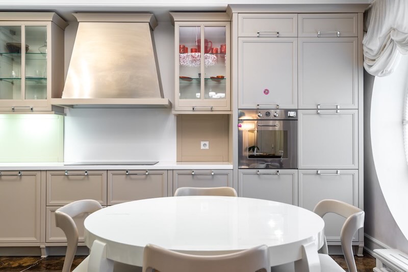
Selecting Colors Based on Kitchen Style
Kitchen Cabinet Depot helps customers decide on how to choose kitchen cabinet colors by understanding their kitchen's style. Your kitchen's design aesthetic plays a crucial role in color selection.
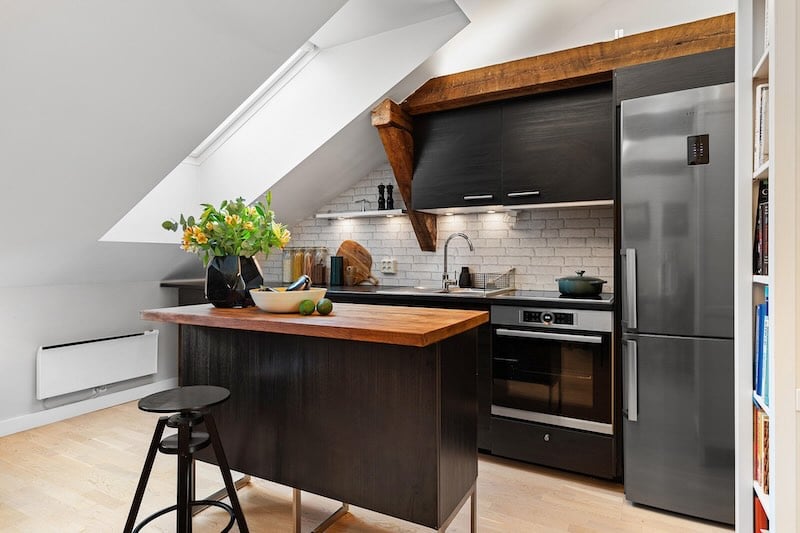
Modern and Contemporary Palettes
Modern kitchen designs showcase a growing trend toward high-contrast combinations. Black and white pairings create powerful visual statements. Sleek gray cabinets bring industrial sophistication to the space. Deep navy or forest green cabinets with metallic hardware offer a contemporary twist. These bold choices look best in spaces filled with natural light.
Traditional and Transitional Options
Subtle approaches work better for traditional and transitional kitchens. Soft whites and neutral tones create lasting appeal. The best combinations for transitional spaces include:
- Warm whites and creamy neutrals for upper cabinets
- Soft grays or beiges for base cabinets
- Wood tones for islands or accent pieces
These combinations create a "forever kitchen" that stays stylish for years. Transitional designs now lean toward earthier palettes. Khaki creams and woodsy tones have become more prominent.
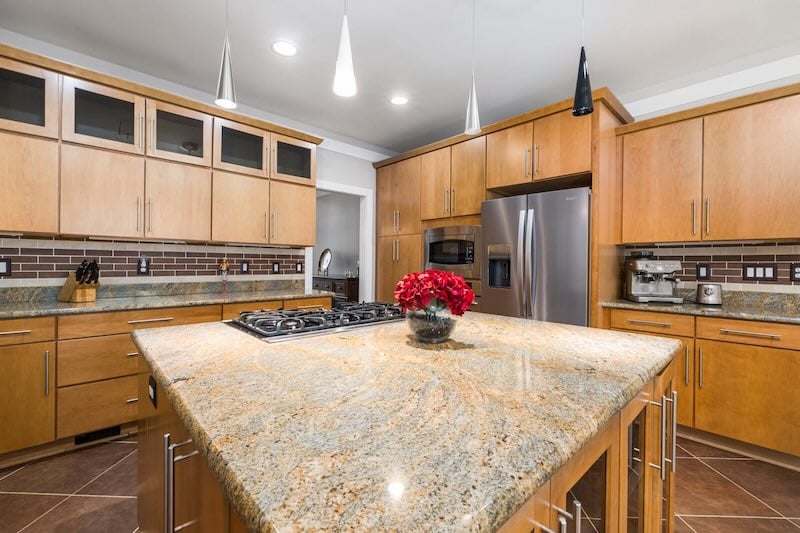
Farmhouse and Rustic Choices
Farmhouse and rustic kitchens draw inspiration from nature. Natural wood tones serve as the life-blood of this style, yet new color combinations bring fresh perspectives. Warm neutral tones and deep earthy browns create welcoming spaces. Sage green cabinets paired with natural elements offer an organic feel.
Rich wood tones mixed with painted finishes excel in rustic designs. Warm taupe lower cabinets matched with cream upper cabinets have proven successful with clients. This blend respects rustic aesthetics while creating bright, open spaces typical of modern farmhouse design.
Kitchen Cabinet Depot matches cabinet colors with architectural styles. Your kitchen can reflect your taste - from clean contemporary lines to cozy farmhouse charm. The right cabinet colors boost your kitchen's character while ensuring lasting style and function.
Making Strategic Color Decisions
Smart color placement can revolutionize your kitchen's look. At Kitchen Cabinet Depot, we have become skilled at color distribution that creates stunning spaces without sacrificing functionality.
Upper vs Lower Cabinet Colors
Our data shows 41% of homeowners opt for contrasting colors in their two-tone kitchens. Visual weight plays a crucial role here. Darker colors pull the eye downward naturally. Lighter shades create an airy feel above. Smaller kitchens benefit from lighter colors on upper cabinets to avoid an overwhelming look.
These combinations deliver excellent results:
- Light uppers with dark lowers to ground the space
- White uppers with stained wood lowers for natural harmony
- Cream uppers with deep navy or charcoal lowers for sophistication
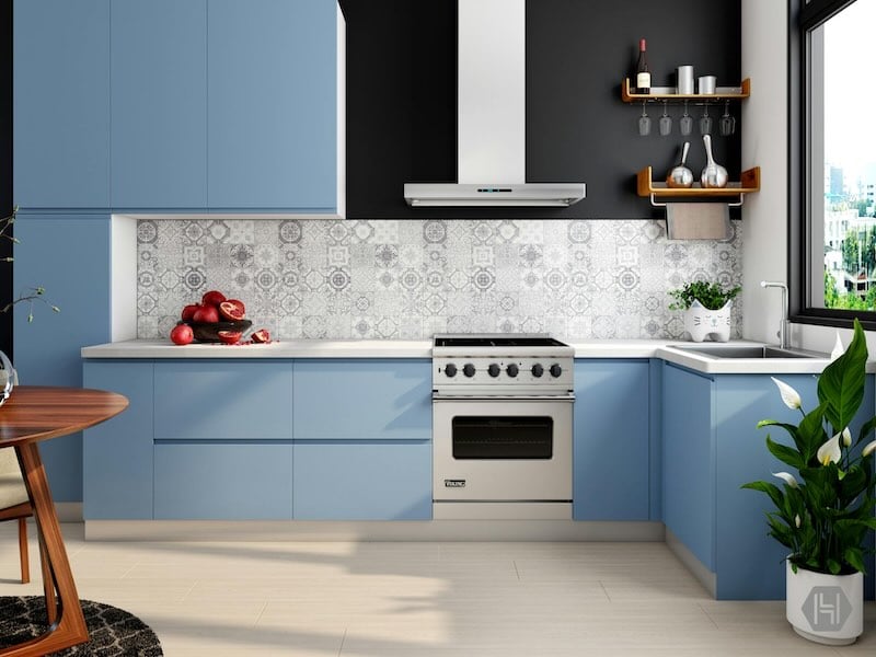
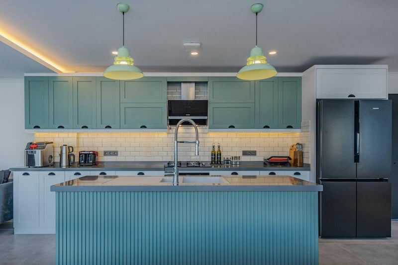
Island Color Considerations
Your kitchen island is a chance to make a bold statement. Our design data reveals a growing trend toward contrasting island colors. Blue leads at 27%, followed by gray at 20%. The results are spectacular when the island serves as a statement piece, especially when it matches your kitchen's style.
The island can beautifully connect different kitchen zones both functionally and visually. The island's color should complement your perimeter cabinets and surrounding elements. A contrasting shade anchors the space and creates an eye-catching focal point.
Accent Color Placement
Your kitchen's architecture and lighting should guide accent color placement. The best designs highlight architectural features while keeping visual balance. To name just one example, see how accent colors work in:
- Built-in coffee stations or bar areas
- Display cabinet interiors
- Open shelving sections
Note that lighting substantially changes color appearance throughout the day. Test your color choices under various lighting conditions before making final decisions. Natural light affects cabinet colors differently - morning sun creates different effects than afternoon light.
Kitchen Cabinet Depot's experience shows the best kitchen designs balance bold statements with timeless appeal. Strategic color placement helps create a space that looks stunning and works beautifully.
Expert Tips for Color Combinations
Perfect color combinations in kitchen design need both artistic vision and technical knowledge. Kitchen Cabinet Depot has refined its approach over the last several years by helping homeowners create their dream kitchens.
Two-Tone Cabinet Strategies
Our design team knows that successful two-tone cabinets work best with the 60-30-10 rule: 60% dominant color, 30% neutral, and 10% accent colors. A bold color paired with a neutral tone creates the right balance. These combinations have proven most successful:
- Deep navy base cabinets with bright white wall cabinets
- Forest green base cabinets with cream wall cabinets
- Charcoal gray base cabinets with light gray wall cabinets
Your countertop selection plays a vital role in choosing island colors to create visual harmony.
Monochromatic Schemes
Monochromatic kitchens offer a sophisticated, timeless appeal. Success comes from varying textures and finishes within your chosen color family. Different sheens work best - matte or eggshell on walls, with semi-gloss or high gloss on cabinets.
Texture becomes the star in monochromatic designs. Different surface treatments like beadboard panels or raised details add visual interest without disrupting the color harmony.
Contrast and Complement Rules
Kitchen Cabinet Depot's experience shows that successful color combinations follow fundamental color wheel principles. Complementary colors should be at least three shades apart to avoid a muddied appearance.
High-contrast designs work best with these proven strategies:
- Balance Bold with Neutral: Vibrant colors paired with softer tones create visual harmony
- Consider Light Levels: Colors need testing under different lighting conditions since natural and artificial light can dramatically affect appearance
- Coordinate with Existing Elements: Cabinet colors should complement rather than compete with countertops and backsplash
Tone-on-tone combinations using different shades of the same color family create subtle depth. This approach works especially well in smaller kitchens where dramatic contrasts might feel overwhelming.
Practical Color Selection Process
Picking the perfect kitchen cabinet colors needs a step-by-step approach. At Kitchen Cabinet Depot, we have a proven process that makes color selection simple.
Creating a Color Board
A detailed color board (or mood board) helps you pick the right cabinet colors. You'll need these items:
- Cabinet finish samples
- Countertop materials
- Hardware pieces
- Flooring samples
- Paint swatches
- Backsplash tiles
- Fabric swatches for nearby spaces
The right arrangement of your color board matters. Put countertop samples above cabinet swatches. A white poster board background lets you assess true colors better.
Testing in Different Seasons
Natural light changes how cabinet colors look throughout the day and seasons. We test colors under these conditions:
Morning Light: Colors look softer and warmer
Midday Sun: Shows the truest color representation
Evening Light: Creates unexpected shadows and tone variations
Artificial Lighting: Shows how colors look during dinner prep
Paint samples need 48-72 hours to cure before you make your final choice. This time allows the true color to emerge.
Making Final Decisions
The time has come to pick your colors. Our structured approach looks at:
- Coordinate with Fixed Elements: Cabinet colors should match existing countertops and backsplash
- Think About Durability: Quality paints with the right finish make a difference - satin cleans easily while semi-gloss lasts longer
- Future-Proof Your Choice: Pick colors that will look good years from now
- Get Second Opinions: Ask family members who use the kitchen regularly
Two-tone kitchens need extra attention to how colors work together. Kitchens with little natural light look better with lighter shades. Bigger, brighter spaces can handle darker, bold colors.
Durable paint gives the best results since cabinets take much wear and tear. A satin finish balances durability and easy cleaning. Semi-gloss works better against sun damage.
Our experience at Kitchen Cabinet Depot shows that careful color selection pays off. Trust your gut but follow these steps - these colors will be part of your daily life for years.
Choosing Kitchen Cabinet Colors
Learning how to choose kitchen cabinet colors can feel overwhelming at first. Our team at Kitchen Cabinet Depot has helped countless homeowners revolutionize their ordinary kitchens into stunning living spaces. The right guidance makes all the difference.
A few key points come off the top of my head. You should test colors in different lighting conditions. Your kitchen's style matters more than current trends. Two-tone designs and strategic accent colors can boost your kitchen's visual appeal without compromising functionality.
Cabinet colors impact your daily life and your home's value significantly. Kitchen Cabinet Depot offers exceptional guidance and quality cabinets in timeless colors and finishes. We're here to help you create your dream kitchen.
Trust your gut and follow our proven process. Your choices should reflect your style and stand strong over time. The perfect kitchen is within reach.
FAQs
How do I choose the right color for my kitchen cabinets?
Start by considering your kitchen's size and style, the ambiance you want to create, and how the color will interact with your space's lighting. Bring samples into your kitchen and test them under different lighting conditions. It's also helpful to consult with a design expert for personalized advice.
Should kitchen cabinets be lighter or darker than countertops?
Generally, it's recommended to have lighter countertops than cabinets for an ideal color blend. This combination creates a balanced look and can make your kitchen appear more spacious and well-designed.
What is considered the most timeless kitchen cabinet color?
White is widely regarded as the most timeless cabinet color. Its popularity has endured for over half a century due to its ability to create a crisp, clean, and refreshing look that brightens the entire kitchen space.
How can I apply the 60-30-10 rule in my kitchen design?
The 60-30-10 rule suggests using 60% of your kitchen's color scheme for the dominant color (like walls and large furniture), 30% for a secondary color (such as accent pieces), and 10% for accent colors (in decorative items). This balance creates a visually appealing and harmonious kitchen design.
What should I consider when choosing a two-tone cabinet color scheme?
When selecting a two-tone cabinet color scheme, consider using lighter colors on upper cabinets to create an airy feel and darker colors on lower cabinets to ground the space. Ensure the colors complement each other and your kitchen's overall style. Also, test how the colors interact side by side and under different lighting conditions before making a final decision.
overall rating: my rating: log in to rate
